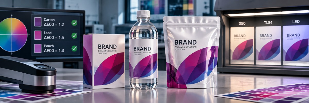
Three packaging products are placed side by side: a folding carton, a label already applied to its bottle, and a flexible pouch. All three carry the same brand color. All three were produced under controlled conditions. All three were measured, and every report reaches the same reassuring conclusion: the measured color values are within the agreed tolerance.
Individually, none of the products looks obviously wrong. The carton appears slightly warmer. The label looks a little cleaner and cooler. The pouch moves in the opposite direction, slightly warmer and redder. Each product can be defended when viewed on its own.
Place them together, however, and they do not quite look like the same brand family.
And the measured values?
They all pass.
This is one of the most interesting situations in industrial color management because it forces us to ask a better question than simply, "What is the Delta E?"
We need to ask whether the measurements are actually describing the same physical and visual condition.
Measurement is essential, but we need to understand what we measured.
I strongly believe in measurement. Without a controlled measurement system, a discussion about color can quickly become an argument between people who each see something slightly differently. Human vision adapts. Our memory of color is imperfect. Surrounding colors affect perception. Lighting changes what we see, and even the context in which a package is viewed can influence the perceived result.
Measurement gives us a common language. It allows production, quality, prepress, suppliers, converters, and customers to discuss a target using values that can be reproduced, compared, and controlled.
But measurement also has limits. A measured value can be completely correct and still be used to answer a question that the measurement itself never addressed.
That is why, before concentrating on a ΔE value, I want to understand what stands behind it. What was the target? Which ΔE formula was used? What measurement condition was selected? Which instrument performed the measurement? What backing was used? What measurement geometry and aperture were applied, where relevant? Was the sample measured immediately after printing, or was it evaluated after lamination, coating, application, filling, or another converting step?
Most importantly, were the values being compared generated under the same defined conditions?
Only then do the values begin to have real meaning.
M0, M1, and M2 are not three levels of accuracy
One potentially dangerous misunderstanding is treating M0, M1, and M2 as three versions of the same measurement, with one simply being newer or more accurate than another.
They are not.
They are different measurement conditions, and they do not necessarily answer the same question.
Imagine a production environment in which one workflow is measured under M1, another still operates under M0, and a third instrument remains set to M2 after an earlier investigation in which the team deliberately wanted to reduce the ultraviolet contribution while studying fluorescence. Each setting may originally have been completely appropriate for its intended purpose.
The problem begins when the reason disappears, but the setting remains. Months or years later, three reports may all be described as "standard," although the measured values were generated under different conditions. The values may look comparable in a spreadsheet while the physical questions behind them are not identical.
This becomes especially important when working with papers and boards containing Optical Brightening Agents. OBAs absorb energy in the ultraviolet region and re-emit part of it in the visible spectrum, particularly toward blue. Changing the UV content of the measurement condition can therefore change the measured substrate white and, consequently, the measured color values of inks printed over it.
So the question is not only, "What are the Lab values?"
It is also, "Under which measurement condition were those Lab values generated?"
A standard is only useful when we know what it standardizes
The word "standard" is used very easily in color discussions. We hear statements such as "we use FOGRA," "this is G7," or "the press is calibrated to the standard." Those statements may sound reassuring, but they are incomplete unless we understand what role the standard, characterization data, reference condition, or methodology actually plays.
ISO 13655 defines important spectral measurement conditions used in graphic arts, including M0, M1, and M2. In modern workflows where fluorescence and optical brighteners are relevant, M1 provides a D50-related measurement condition intended to create a more controlled relationship between measurement and standardized graphic-arts viewing.
Viewing conditions are another part of the same chain. Controlled color evaluation under standardized D50 viewing conditions is not the same as approving color under whatever ceiling LEDs happen to be installed above the quality desk. A light source may be excellent for general factory use and still be unsuitable as the controlled reference for critical color approval.
FOGRA39, FOGRA51, and FOGRA52 should also not be treated as interchangeable references, nor as three generations where the highest identifier automatically represents the "best" condition. FOGRA39 belongs to an older coated reference environment and remains important because many legacy customer files, proofing systems, profiles, and specifications were built around it. FOGRA51 represents a modern coated reference condition in the M1 environment, while FOGRA52 represents a modern uncoated reference condition, also based on M1.
FOGRA52 is not simply FOGRA51 with a different substrate white. Coated and uncoated papers represent different printing conditions. Surface scattering, achievable gamut, solids, overprints, tonal behavior, and substrate white all differ.
The correct reference condition matches the actual requirement.
The same reasoning applies internationally. GRACoL provides characterized reference print conditions widely used in North American workflows. If a customer's files, proofs, contracts, and approval systems are based on a GRACoL reference, there is no technical reason to replace it just because production takes place elsewhere.
G7 belongs to a different category. It is primarily a calibration and alignment methodology, strongly associated with neutral tonality and gray balance. A printing system can use G7 methodology while still aiming at GRACoL, FOGRA, or another defined reference appearance.
For digital printing, PSD—ProcessStandard Digital—provides a process-control framework for digital production. It helps govern stability, color fidelity, verification, and workflow. A digital press may simulate a FOGRA or GRACoL reference appearance, but that does not mean the press has become an offset press.
Reference appearance and production mechanism are different concepts.
Viewing conditions are part of the color system
Sometimes several products look different under normal office or factory lighting, move closer together inside a controlled viewing booth, and then change their relationship again when the illumination changes.
The colorants have not changed.
The appearance has.
Color does not live inside a PDF, a recipe, a Lab value, or a ΔE value. Light reaches an object. The substrate, ink, coating, adhesive, laminate, bottle, contents, and every other optical layer absorb, reflect, scatter, transmit, and sometimes fluoresce portions of that light. The visual system interprets what finally reaches the eye based on illumination, surroundings, geometry, adaptation, and context.
That is why saying "we have very good LED lighting" is not enough for critical color evaluation. The LEDs may be bright, expensive, energy efficient, and excellent for production. They still need to represent the appropriate controlled viewing condition if they are being used to approve color.
A clear label is not simply the same print on another substrate
Transparent labels make the issue even more interesting. Suppose a clear pressure-sensitive label is measured on a white backing and matches the target well. The label is then applied to a clear or colored bottle through an adhesive layer, with the actual product visible behind it.
Are we still looking at the same optical object?
Not really.
The final appearance can now be influenced by the facestock, adhesive, bottle, contents, curvature, background, and viewing geometry. If we remove the label from the bottle, place it on a white tile, measure it, and then claim that the resulting values completely describe what the customer sees on the finished bottle, we have changed the object being evaluated.
The measurement may be perfectly correct.
The interpretation may not be.
For transparent and semi-transparent constructions, backing is not a minor laboratory detail. It can become part of the color definition. In some applications, the correct evaluation state isn't a detached label at all, but the label applied to the actual bottle or a defined representative construction.
The finished product has to be part of the color discussion.
The same thing can happen after lamination
Flexible packaging creates a similar challenge. A printed web can look excellent coming off the press. Process conditions are stable, measured values are within tolerance, and the retained printed material compares well with the press-side reference.
Then the material is laminated and the appearance changes.
That does not automatically mean the printing changed.
Lamination creates a new optical system. Another film is introduced. Adhesive becomes part of the construction. Gloss may change. Reflection and scattering may change. The optical path through the package changes, and the background or additional layers may influence the final appearance.
This is why I keep returning to one simple question:
What product will the customer actually see?
If the customer buys a laminated pouch, then ultimately the laminated pouch is the object whose appearance has to work. The printed web before lamination is an important process-control stage, but it is not the complete product.
The same principle applies to coatings, varnishes, clear films, metalized structures, sleeves, bottles, and many other packaging constructions. A color target does not exist independently of the physical object that carries it.
A ΔE value is not complete without the formula
Another detail that is often overlooked in reports is the simple notation "ΔE."
But which ΔE?
ΔE*ab, commonly referred to as Delta E 76, and ΔE00 are not the same calculation. They model perceptual color difference differently, so the resulting values aren't directly interchangeable.
A tolerance established for one formula cannot simply be transferred to another formula and treated as though the same numerical limit still carries the same meaning.
This matters in real production because one department may use an older ΔE*ab requirement while another system or customer specification uses ΔE00. Both reports may include a value called "Delta E," but they may not be using the same mathematical language.
When we define a tolerance, we are therefore not defining only an acceptance value. We are defining part of a measurement system. The formula, target, measurement condition, sample condition, and tolerance belong together.
The recipe is not the brand color
This is one of the most important distinctions in brand-color management.
Suppose the same violet brand color must appear on a folding carton, a label, and a flexible pouch. There is a natural temptation to search for one CMYK or multicolor recipe that every production route can use. It feels controlled: one brand color, one recipe.
But CMYK percentages are not the brand color.
They are device- and construction-dependent instructions intended to reproduce the brand color.
The same governed target may require one recipe on coated carton board, another on film, and another on a transparent label. Those recipes may be significantly different and still be correct.
That does not contradict standardization. It is part of good standardization.
The color identity should be standardized. The recipe is process-dependent.
The objective is not for every press to use the same percentages. The objective is for different production systems to reproduce the same intended appearance as closely and consistently as their physical capabilities allow.
This distinction becomes especially important when local production teams begin correcting recipes over time. One operator makes the color slightly warmer because it looked too cool on one substrate. Another adjusts magenta because a different job did not match a retained reference. A third workflow inherits a recipe from an older material.
Every individual correction may have seemed reasonable at the time. After several years, however, the organization may have multiple entries with the same brand-color name, while the technical definitions underneath them no longer match.
At that point, the problem is no longer simply color matching.
It is color governance.
Spectral data gives us more than a single Lab target
For critical brand colors, a single set of Lab values is not always the strongest way to communicate color identity across a complex production chain.
Spectral data provides a richer description of the color. Where the application and substrate fall within its intended scope, CxF/X-4 provides a standardized way to exchange spot-color spectral characterization information along with relevant measurement metadata.
This is especially useful when the same brand color must travel between multiple production systems, suppliers, converters, and geographic locations.
But spectral data should not become another magic solution.
A transparent label on a bottle, a metalized construction, a strongly directional surface, or another optically complex structure may not be fully described by spectral data generated under a different physical condition. The spectral definition remains extremely valuable, but it does not remove the physics of the final construction.
Spectral values describe the color more completely.
They do not make the finished product irrelevant.
An ICC profile cannot fix an unstable press condition
When a color problem appears, there is often a temptation to move quickly toward the ICC profile. Perhaps a new profile is needed. Perhaps the rendering intent is wrong. Perhaps another conversion strategy will solve the problem.
Sometimes that is exactly where the investigation eventually leads.
But an ICC profile should describe a stable and characterized production condition. It should not be expected to create that stability.
Before the profile, the press has to be mechanically and operationally healthy. Calibration must establish a repeatable condition. The relevant media or substrate condition has to be controlled. Characterization then records what that stable combination of press, ink, media, imaging mode, and measurement condition actually produces.
Only then does the destination profile have a reliable physical basis.
A good ICC profile can describe a well-characterized press condition very effectively.
It cannot create one.
If the physical process is drifting, rebuilding profiles may simply create a more sophisticated description of an unstable condition.
Cross-press matching does not mean making every press identical
The same reasoning applies when matching different digital presses, or when aligning digital and conventional printing.
The objective is not to make the physical printing systems identical.
They are not identical.
They may use different inks, imaging mechanisms, substrates, gamuts, calibration systems, and physical print formation.
The reference appearance can be governed.
A clear source or reference condition can be defined. Each press can be stabilized and characterized independently. Each media family can have an appropriate destination profile or equivalent output description. The DFE can then manage the transformation from the interpreted source condition toward the characterized digital destination.
Two digital presses may therefore have completely different destination profiles, calibration states, and characterization data while still aiming for the same reference appearance.
That is not inconsistency.
That is exactly what color management is designed to do.
The same principle allows a digital system to reproduce an appearance based on FOGRA51, FOGRA52, GRACoL, or another declared reference condition without pretending that the digital press physically operates like the process from which that reference condition originated.
The reference defines the intended appearance.
The destination profile describes the real output system.
The color-management workflow connects the two.
Rendering intent is also a decision, not a default
Once color conversion enters the workflow, rendering intent must become a deliberate decision rather than a setting inherited because somebody selected it years ago.
Relative Colorimetric and Perceptual do not simply mean "accurate" and "safe." They represent different transformation strategies, and their behavior depends on the profiles, the Color Management Module, the relationship between source and destination gamuts, and the content being reproduced.
Photographic imagery, process graphics, and a critical named brand color do not necessarily have the same color-management priority simply because they happen to exist in the same PDF.
That is why a governed color strategy has to understand the source, the destination, the content, and the intended visual result.
A default is not a strategy just because it has been used for a long time.
Calibration, characterization, profiling, and reference appearance are not the same thing
These terms are sometimes mixed together in production discussions, but they represent different stages of the workflow.
Calibration establishes a repeatable working condition.
Characterization measures what that repeatable condition actually produces.
The ICC profile uses characterization data to describe the output condition for color conversion.
A reference condition such as FOGRA51, FOGRA52, GRACoL, or another declared condition describes the appearance we intend to reproduce.
PSD or another appropriate process-control framework helps maintain and verify the digital production system.
G7 can provide a methodology for aligning neutral tonality and gray balance.
CxF/X-4 can help communicate spectral spot-color information where appropriate.
These elements work together, but they are not substitutes for one another.
A calibrated press is not automatically correctly characterized. A characterized press does not automatically use the correct reference condition. A good profile does not guarantee that the substrate or press condition has remained stable. A small ΔE value does not automatically guarantee the finished package will look right under the conditions the customer will actually see it.
Color management becomes reliable when these layers are connected, not confused.
Measurement is not the enemy of the eye, and the eye is not the enemy of measurement
Color discussions sometimes become an unnecessary argument.
"The measured values are within tolerance."
But the customer sees a difference.
Or the opposite:
"It looks the same to me."
But the measurement shows a difference.
Both positions miss the point if they treat the discussion as over.
The eye and the spectrophotometer are not competitors. They are different tools.
The instrument provides objective measurement values, repeatability, traceability, and process control. Human vision evaluates the product the way another human being—ultimately the customer or consumer—will experience it.
When the two do not agree, we should not immediately decide that one of them is wrong.
We should investigate why.
Is the measurement condition correct? Are the viewing conditions controlled? Are we measuring the right physical object? Is the backing appropriate? Is fluorescence involved? Did lamination or coating change the appearance? Are all parties using the same ΔE formula? Is the same target definition being used across all production routes? Are the instruments sufficiently aligned for the required tolerance? Is the target spectral or only Lab-based? Is the sample being evaluated in its intermediate or final state?
And is the recipe being defended really the identity of the brand color—or only one production system's way of trying to reproduce it?
Those questions are much more useful than arguing about whether the eye or the instrument should win.
Moving beyond pass/fail
In the end, the most useful question is not:
Did the color pass?
It is:
What exactly passed, under which measurement and viewing conditions, against which target, using which evaluation method, and does that result represent what the customer will actually see?
That is a small change in wording, but a significant change in the way we manage color.
ΔE values are essential. Lab values are essential. Spectral values can be essential. Calibration is essential. Characterization is essential. ICC profiles are essential. Defined reference conditions are essential. Controlled viewing is essential.
But none of them is the complete color system by itself.
A reliable color match is created when the target, measurement condition, viewing condition, substrate, printing process, calibration, characterization, profile, color strategy, and finished product all belong to the same controlled logic.
And when the measured values are within tolerance, and the finished product also looks right, we know something much more useful than simply that it passed.
We know the complete color workflow describes the same reality.