Ronen Dolev | Industrial Color Engineering Series | July 2026
A report that says PASS, and an observer who disagrees
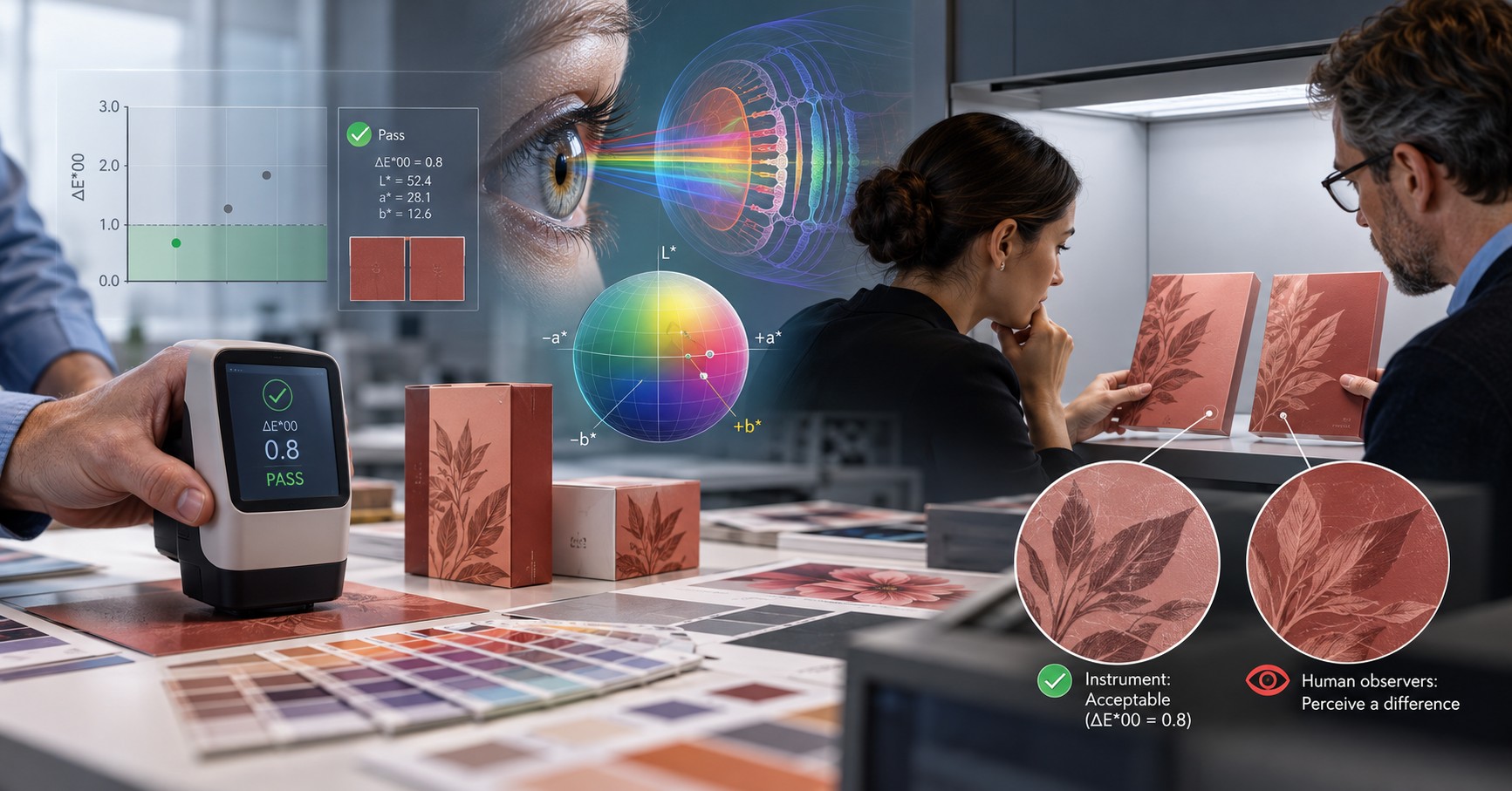
Two approved packaging samples are examined under the same viewing booth. The measured difference in a critical brand color is ΔE00 = 1.3, below the customer's agreed limit of 2.0. One reviewer sees a distinct shift toward red; another considers the pair practically identical. The instruments are calibrated, the color values have been checked, and neither person is being careless. The disagreement is real, but what exactly are they judging?
A color tolerance is an acceptance rule, not a declaration that a difference is invisible. The visibility of a difference depends on the stimulus, viewing task, field size, surrounding colors, light level, and observer. A numerical result describes a defined comparison; a person experiences an entire visual scene. Confusing these two questions underlies many avoidable print-color disputes. [1, 2]
This article addresses the visual observer rather than repeating familiar topics like source profiles, press calibration, or color matching under multiple illuminants. Its central problem is how to make a defensible release decision when instrument readings and human judgments diverge—even with otherwise competent color control.
The physiological journey from light to perceived color
Color begins with the spectral distribution of light entering the eye, but sensation is not produced by a single wavelength detector. Under photopic conditions, the retina uses three overlapping classes of cone photoreceptors, conventionally described as L, M, and S according to their relative sensitivity to longer, middle, and shorter wavelengths. Each cone class responds across a broad band of the visible spectrum. A given cone cannot identify the wavelength of an absorbed photon on its own; color information emerges from comparing signals across cone classes. Rods contribute mainly at low light levels and do not provide the same three-channel color discrimination. [3]
Retinal and post-retinal pathways then transform cone signals into opponent-like mechanisms that compare light–dark, red–green, and blue–yellow information. Neural adaptation changes responses based on preceding light exposure and the surrounding visual field. The brain also interprets the probable illumination, shape, boundaries, and context of the surface. This is why a color seen in isolation need not look identical when placed next to a strongly contrasting background, even though the print itself has not changed. [4, 5]
Visual judgment is therefore not a spectrophotometer with a biological display attached. It is an adaptive perceptual process. This adaptation is normally beneficial: it helps objects appear relatively stable as the environment changes. But it also means that the same printed patch can be perceived differently depending on what was viewed immediately before it, where it appears in an image, and how much of the visual field it occupies.
Rods and cones: why the retina has two fundamentally different visual systems
The retina does not use one receptor type for all viewing conditions. Rods are highly sensitive photoreceptors that support vision when only a small amount of light is available. Cones require more light but supply the signals from which fine spatial detail and most human color discrimination are derived. In daylight, or photopic vision, cones dominate. Under extremely dim, scotopic conditions, rods dominate, and reliable hue discrimination largely disappears. Between these states is mesopic vision, in which both receptor systems may contribute to what is seen. This distinction matters because standardized color evaluation assumes a controlled, sufficiently illuminated viewing condition rather than an arbitrary factory corner or dim storeroom. [14, 15]
Biological property | Cones versus rods: the practical consequence |
|---|---|
Operating light level | Cones: brighter/photopic conditions; rods: very dim/scotopic conditions |
Color discrimination | Cones: three overlapping spectral classes; rods: no ordinary trichromatic discrimination alone |
Spatial resolution | Central cone vision: fine-detail inspection; rod-driven vision: higher sensitivity but lower acuity |
Retinal distribution | Cones densely packed in central fovea; rods concentrated beyond the foveal center |
Print-quality implication | Keep illumination, adaptation, sample size, and viewing position controlled; do not compare daylight and dim-light judgments as equivalent. |
Rods carry the light-sensitive pigment rhodopsin and provide excellent sensitivity to faint light, but the normal rod system does not offer three independent wavelength channels that could support ordinary trichromatic color vision. Rods are distributed strongly in the peripheral retina and are absent from the central foveola, while cones are densely packed in central vision, where high-acuity inspection occurs. Under lower illumination, the relative apparent brightness of different colors can change as rod activity becomes more important; this is one reason a product judged in bright daylight may not retain the same visual balance at dusk. The effect is not evidence that the ink itself changed. [14, 15]
Cones have three broadly overlapping sensitivity classes, designated L, M and S for long-, middle- and short-wavelength sensitivity. These are not narrow detectors that separately identify red, green and blue photons. For example, both L- and M-cones respond over much of the same spectral range; their relative excitations help the visual system distinguish reddish from greenish signals. S-cones contribute strongly to shorter-wavelength discrimination. The visual system reconstructs color by comparing signals, not by assigning a wavelength label to each photon. The densities, distribution, and spectral response of these cones are not physiologically identical across all observers. [3, 16]
From the photoreceptors to the brain: where color comparison begins
Photoreceptor responses are reorganized by retinal circuitry and later visual pathways into opponent signals. One pathway broadly compares L- and M-cone activity; another compares S-cone activity with a combination of L and M activity; a luminance-related pathway carries different information again. This organization helps explain why two colors with similar overall brightness can be distinguished by hue, and why a change in surrounding color can alter the appearance of an otherwise unchanged patch. These biological mechanisms are more complex than mapping a measured wavelength directly to a named color. [3, 17]
The brain also adapts to the previous visual environment. A reviewer coming from a bright workstation and a colleague already adapted to the viewing booth need not begin the inspection from exactly the same visual state. This does not render visual appraisal arbitrary: it makes observer adaptation, consistent presentation time, and controlled surroundings essential parts of a reproducible color-inspection method. [4, 5]
The standard observer is a convention, not an average of everyone's experience.
In instrumental colorimetry, measured spectral data are combined with an assumed illuminant and standard color-matching functions to calculate tristimulus values and, subsequently, coordinates such as CIELAB. The CIE standard observer provides a reproducible common reference for this calculation. It is indispensable for trade and quality control — but it does not describe every individual pair of eyes. The frequently used 2° and 10° observers refer to angular viewing fields and their associated color-matching functions, not two categories of people or levels of visual skill. [3, 6]
Human observers vary in cone photopigment sensitivities, pre-retinal filtering by the lens and macular pigment, age-related ocular characteristics, and higher-level perceptual processing. Research finds meaningful differences in color judgments even among observers conventionally described as having normal color vision. A person can be sensitive in one region of the color space yet less discriminating in another; no single ranking of individuals covers every color pair. [7, 8]
A particularly important effect is observer metamerism: two materials may match for a standard observer under a specified light, yet differ for real viewers because their spectral reflectances interact differently with individual visual sensitivities. This is distinct from a match that breaks only when the illuminant changes. The full engineering treatment of illuminant metamerism belongs to a separate article; the relevance here is simply that normal observer diversity can matter even when the lighting remains fixed. [9]
Why normal color vision still differs from person to person
Normal trichromacy describes a functional category, not one identical biological instrument shared by every human being. Natural variation in L- and M-cone opsin sequences can shift their effective spectral sensitivity. People also differ in the optical density of the crystalline lens and macular pigment, the amount of pigment within the cones, and aspects of neural processing. These variations can occur without a clinically classified color-vision deficiency. Recent research has quantified how such differences affect individual color matches on printed and dyed samples as well as on emissive displays. [8, 16, 18]
The eye's optical media contribute to this variability. The lens filters incoming short-wavelength light, and its transmission often changes with age. Macular pigment selectively filters shorter wavelengths in central vision, and its density also differs among observers. In consequence, the spectral light reaching one person's cones is not necessarily identical to the light reaching another person's cones even when both view the same physical object from the same position. These differences arise from the biological measurement pathway, not necessarily from errors in the object or the instrument. [16, 18]
Cone ratios also vary widely between individuals. The relative number of L and M cones does not directly rank someone's ability to approve print color: the nervous system can compensate for some variations, and discrimination depends on which colors are being compared. A reviewer may be unusually consistent for blue-violet comparisons and less sensitive in another region, while another shows the opposite pattern. Qualification should therefore reflect real color-discrimination tasks rather than an assumed universal "best eye." [7, 8, 18]
Color-vision deficiency: important, but not the explanation for every disagreement
The phrase "color blindness" is commonly used for color-vision deficiency (CVD), but most affected people do not see a colorless world. Red–green deficiencies are the most common, involving altered or absent function in pathways associated with long- and middle-wavelength cone signals; blue–yellow deficiencies are less common. Some conditions are inherited; others can be acquired through changes affecting the eyes or nervous system. Severity and practical consequences vary substantially. [10]
Assuming that every disagreement between a customer and a press operator implies a visual deficiency would be a serious engineering mistake. Differences also occur among people with normal color vision, and a customer can legitimately detect a visually significant appearance difference that a small-aperture ΔE00 reading does not capture. Conversely, a person may have a real color-vision limitation without it explaining the current complaint.
For personnel whose jobs require subtle color discrimination, a professionally administered color-vision assessment may be appropriate as part of a consistent occupational competency program. Screening color plates mainly address particular categories of deficiency; hue-arrangement tests and specialist tests examine other aspects. Such screening must be respectful and should not dismiss an individual's observation or substitute for investigation of the samples. A qualified vision professional should make the diagnosis. [11]
The X chromosome and inherited red–green color-vision deficiency
The common inherited red–green deficiencies are most often associated with changes in the genes encoding the L- and M-cone photopigments. Their gene names are OPN1LW and OPN1MW, and both are located in a closely related region of the X chromosome. Because their DNA sequences are similar, unequal recombination or other genetic rearrangements can change gene copy number, create hybrid opsin genes, or alter the spectral properties or availability of one photopigment. It is more accurate to describe a change in an opsin gene or its arrangement than to call the entire chromosome "defective." [19, 20]
The inheritance pattern explains why the common red–green deficiencies occur more often in males. In the usual XY chromosomal pattern, the individual has one X chromosome. If that X carries a variant that disrupts the relevant photopigment function, there is no second X copy of the same gene locus to provide a typical alternative. In the usual XX pattern, an individual has two X chromosomes; with an X-linked recessive red–green deficiency, one unaffected copy often supports sufficient function, so an individual carrying a variant on only one X may have typical or near-typical clinical color vision. Manifestation in women is possible, including when variants affect both X chromosomes or, less commonly, through particular X-inactivation or chromosome arrangements. The simple schoolbook inheritance diagram is useful but not exhaustive. [19, 20]
For an approximate population context, MedlinePlus Genetics reports red–green deficiencies in about one in 12 males and one in 200 females among populations with Northern European ancestry. These figures should not be presented as identical worldwide rates: prevalence varies across populations. This sex difference concerns common inherited red–green conditions; it does not establish that men, as a group, are less reliable observers for every print-color comparison. [19]
Protan, deutan, tritan, and rare monochromacy are not the same condition.
Protan-type deficiencies involve the L-cone mechanism and can occur as anomalous trichromacy, with shifted pigment sensitivity, or as a form of dichromacy in which normal L-cone discrimination is unavailable. Deutan-type deficiencies analogously involve the M-cone mechanism. In protanopia and deuteranopia, an entire class of normal cone-mediated discrimination is functionally missing, but the affected person does not necessarily see in black and white. The familiar phrase "red–green blindness" is a simplification: confusion can involve several parts of the red, green, yellow, and brown range, and the pattern depends on the deficiency subtype. [10, 19]
Tritan-type blue–yellow defects involve the S-cone pathway and are much less common. The OPN1SW opsin gene is on chromosome 7, not the X chromosome, and inherited tritan defects can follow a different inheritance pattern. Rare conditions causing severe or nearly complete loss of color discrimination can involve additional genes and substantially different visual symptoms, including reduced acuity or light sensitivity. Acquired color-vision changes may result from eye disease, injury, aging, or medication effects rather than an inherited opsin variant. Therefore, neither "color blindness" nor "chromosome defect" denotes one uniform diagnosis. [10, 19, 21]
For industrial color approval, these genetic distinctions matter most when designing a fair and appropriate competency assessment. A congenital deficiency cannot be inferred merely because two reviewers disagree, and not every individual with a diagnosed deficiency will be unable to perform every print-quality task. Screening tools differ in what they detect. Qualified vision professionals make clinical diagnoses and interpretations, while the plant must define the visual tasks and performance evidence required for a color-critical role. [10, 11]
What the spectrophotometer measures — and what ΔE00 leaves out
A spectrophotometer measures light from a selected area under a specified measurement geometry and mode. The resulting spectral information can be used to calculate color coordinates for a declared illuminant and standard observer. ΔE00 then estimates the difference between two CIELAB colors, with corrections intended to better match human discrimination than a simple unweighted Lab distance. It is an engineering metric designed for particular types of color differences, not a complete model of an entire visual experience. [1, 6]
The CIE has evaluated the performance of difference formulae using visual experiments and has separately issued guidance on evaluating differences between entire images. Those publications underline a practical fact: small adjacent patches, extended images and different appearance attributes are not interchangeable tests. A single-patch measurement cannot, by itself, quantify changes in image texture, spatial structure, gloss distribution, or the perceptual influence of surrounding artwork. [2, 12]
A glossy ink film and a matte reference may yield relatively close values under a particular instrument geometry yet look different when tilted under a viewing lamp. Likewise, a smooth field and one with subtle mottling can have similar averaged coordinates but quite different perceived uniformity. The instrument may be working correctly in both cases: the operator asks it to evaluate a color coordinate, while the client judges a surface or an image.
Five distinctions that prevent misleading PASS/FAIL decisions
What was measured | What the viewer may be judging |
|---|---|
A small, averaged color patch | A larger printed area with gradients or nonuniformity |
CIELAB difference at one location | Contrast against nearby colors and neighboring packages. |
One instrument geometry | Specular highlights, texture, curvature and viewing angle |
Standard-observer values | A particular person's physiological and perceptual response |
Colourimetric tolerance | A commercial appearance requirement for the finished object |
Two different processing chains: physical spectra versus biological color appearance
A spectrophotometer records reflected or transmitted light according to a specified optical geometry, spectral range and measurement procedure. Software then weights the recorded spectrum with an agreed reference illuminant and standardized color-matching functions to produce XYZ and, after the appropriate transform, Lab. CIEDE2000 takes two such sets of color coordinates and calculates an adjusted perceptual color-difference index. The result is repeatable under declared conditions precisely because it does not change with the age, cone genes, or adaptation state of the human reviewer. [1, 3, 6]
The biological path is different. Light passes through each observer's cornea, lens, and macular filtering, excites that person's own rods and cones according to their sensitivities, and is compared by retinal and cortical processing shaped by adaptation and visual context. The instrument does not measure neural opponent signals or the observer's preference and acceptance decision. The retina, meanwhile, does not output an objective Lab triplet. Both processes are valid for their own purposes, but they answer different questions. [14, 16, 18]
The field-size distinction is particularly instructive. The CIE 1931 2° and CIE 1964 10° standard-observer functions correspond to different angular-size viewing conditions, with different relevant visual-field physiology. They are not correction settings to make a dissatisfied individual observer "pass." For a dispute involving a very small color chip versus a broad package panel, the viewing geometry and field size should be explicitly considered, and any change in the calculation standard must be agreed and applied consistently. [6, 22]
Observer metamerism demonstrates the remaining limitation even under fixed lighting: two printed surfaces with different spectra can match under the standard observer's functions while some normal individuals perceive a mismatch. This is not proof of faulty eyesight, and it is distinct from the better-known case in which a match changes under a different lamp. An acceptance procedure cannot guarantee identical perception in every customer. It can document the reference, standard observer, sample construction, and controlled visual evidence used for the decision. [9, 18]
Why two normal observers can disagree under the same lamp
Several mechanisms may overlap. One observer may be more sensitive to small hue changes in the selected color region. Another may attend primarily to lightness or gloss differences. Adaptation may differ if one person has been viewing the sample for several minutes and the other has just entered the booth. The immediate background can exaggerate or mask the apparent difference; a large color field may produce a different judgment from a tiny isolated chip. [4, 5, 7]
Even language and task framing matter. Asking "Are the colors identical?" invites a different decision than asking "Would this difference justify rejecting production?" Those are distinct questions: perceptibility, acceptability, and preference should not be merged into one unqualified yes/no. A person may clearly see a difference and still judge the product acceptable.
One observer should not be declared the "gold standard" simply because that person is more demanding. Nor should a majority vote automatically override a traceable contractual requirement. The correct procedure is to make the observation repeatable, establish what attribute is disputed, and compare the evidence with the agreed acceptance policy.
Perceptible, acceptable and preferred: three distinct judgments
A person may reliably detect a difference yet still consider both samples acceptable. Conversely, a difference that is barely visible in an isolated test may become commercially objectionable when repeated across a row of identical packages. Perceptibility concerns whether a difference can be detected; acceptability concerns whether that difference violates the product requirement; preference concerns which appearance a viewer likes more. These decision endpoints are not interchangeable and should be recorded separately in a structured evaluation. [2, 12]
The quality team should also distinguish chromatic mismatch from changes in material appearance. Gloss, relief, surface texture, fluorescent effects, and spatial mottle can alter the customer's experience without producing a proportional increase in a single-patch ΔE00 value. Biological observer differences should be investigated only after the physical sample and the presentation conditions have been made comparable. Otherwise, the team risks labeling a material effect as a personal vision issue. [2, 12]
A practical visual-evaluation protocol for a print-quality department
The most effective response to a disagreement is not an immediate color correction. It is a controlled visual experiment that separates the color difference from contextual and material effects while preserving real-world product application.
1 Establish the comparison contract
Confirm the approved master, product state, required illuminant and viewing condition, tolerance formula, instrument conditions, sample backing, and whether the requirement concerns a uniform spot, an image region, or the finished package. An isolated patch can be used to diagnose the color component of the dispute; it should not silently replace final-product approval.
2 Control the viewing environment
Use a properly maintained viewing station that conforms to the applicable requirements of ISO 3664:2025 for critical print appraisal. Standardize sample position, viewing angle, surrounding neutral field, illuminance, and viewer acclimation. Avoid uncontrolled daylight, reflected coloured walls, bright screens, and moving between markedly different light sources during a single decision. Record the actual viewing arrangement rather than writing only "D50". [13]
3 Separate patch comparison from product appearance
First inspect matched-size uniform patches on an agreed neutral support, side by side and without distracting artwork. Then compare the finished products at realistic distance, orientation and presentation. If the judgments differ between these two tests, that is useful diagnostic evidence, not a contradiction to conceal.
4 Use a short, repeatable observer study
When disagreement persists, use a small group of qualified reviewers and blind the sample identity. Randomize left–right placement, repeat selected comparisons, and record "difference visible", "acceptable" and "preferred" as separate responses. Log the reviewer, time, and environmental conditions. A consistent directional judgment across randomized repeats carries more evidential weight than a single confident statement; a small panel is not a population survey, so its limitations should be acknowledged.
5 Reconcile the two forms of evidence
Confirm instrument repeatability, measurement aperture, backing, and sample position. For a visibly nonuniform field, measure several locations and report the spread rather than relying on one average. For a sheen or textural complaint, add an appropriate appearance-oriented test. Record any agreed change in acceptance criteria before continuing production, not retroactively after seeing an unfavorable result.
An additional observer-focused validation within the existing protocol
When the concern specifically involves disagreement among viewers, add a controlled repeatability check rather than relying on one confident inspection. Use at least two preselected specimen positions, mask the identity of the approved and test samples, randomize order, and repeat the same comparison after a consistent period of visual adaptation. Record individual judgments without allowing one person to influence the next. Keep the set and order of questions constant: first, "Is a difference visible?" next, "Which attribute changes?" and finally, "Is it acceptable for this product?"
A pattern that is reproducible only for one observer does not, by itself, establish a printing defect or a medical diagnosis. It is evidence about inter-observer variability, which can be addressed with additional observers, a task-relevant professional color-vision evaluation where warranted, and agreement about how the customer's appearance requirements will be judged. If disagreement vanishes when contextual artwork is masked, the team has stronger evidence for a surround or image-context effect than for an inherent defect in the isolated ink color.
Troubleshooting: the instrument passes, the client sees a mismatch
Troubleshooting identifies which relationship has failed: the numerical comparison, the viewing setup, the print surface, the observer protocol, or the customer's original acceptance specification. The action must follow that classification rather than being chosen out of habit.
Observation | Diagnostic test | Appropriate response |
|---|---|---|
Difference is seen only when samples are adjacent. | Repeat isolated-chip comparison on identical neutral surround; randomize positions. | Document a perceptible but possibly acceptable difference; clarify the contract rather than automatically altering ink. |
Difference depends on sample angle. | Tilt both samples in controlled light; inspect gloss, coating, and texture | Assess finish or surface appearance; avoid compensating for gloss using a hue-only color correction |
Only part of a large color field looks different | Map multiple positions; inspect spatial uniformity and printed structure | Investigate local print variation, not only the average patch ΔE00 |
Different reviewers disagree repeatedly. | Use controlled repeated comparisons and appropriate vision assessment where job-relevant | Record inter-observer variation; make a documented acceptance decision with defined rules |
Difference emerges only in final packaging. | Compare print intermediate with final construction at agreed backing and viewing geometry. | Assess lamination, clear coat, white support or application geometry. |
Instrument reports differ on the same sample. | Check instrument state, aperture, backing, measurement mode, and inter-instrument agreement. | Repair measurement comparability before adjusting production |
Do not mistake an observer effect for a press-color correction requirement.
If the complaint persists only for one viewer under standardized conditions, do not immediately alter the CMYK or expanded-gamut recipe. First confirm the viewing task, the individual's adaptation time, specimen position, and repeatability of the observation. If both reviewers consistently see the same direction of mismatch in isolated fields, the case for a genuine chromatic difference becomes stronger. If the effect emerges only when the carton is tilted, or a protective layer is present, an appearance-oriented measurement and material investigation should precede any recipe change.
If a visual discrepancy is demonstrably tied to cone-mediated discrimination, better control of illumination and observer testing may reduce disagreement but cannot make all normal observers spectrally identical. Likewise, a quantitative spectral measurement cannot be expected to predict an individual person's complete subjective experience. A successful troubleshooting outcome is therefore a documented and reproducible acceptance rule, not the claim that the eye and the instrument must produce the same verdict under every circumstance.
Technology-specific consequences: offset, flexography and digital LEP
The biology of color perception does not change with the printing technology. What changes is the kind of physical appearance mismatch a process can introduce. Offset samples may differ in ink-film texture, local solids, substrate coating, or varnish sheen even when a spot patch is close to target. Flexographic films may show surface pattern, local tone structure, and final lamination effects that a single measurement position does not capture. LEP samples may be consistent in average process color while showing localized gradients, transfer-related nonuniformity, or substrate-dependent gloss differences. These are diagnostic possibilities, not characteristics that every press in the category must exhibit.
The remedy should correspond to the defect. Do not move CMYK or expanded-gamut recipes simply because the client notices a sheen difference. Do not rebuild a color profile to solve spatial mottling. Conversely, if matched-size patches under controlled viewing genuinely show a repeatable hue mismatch and the process is physically stable, a measured recipe or conversion adjustment may be warranted—provided it is re-verified on the final product.
A worked decision: ΔE00 = 1.3, two reviewers, one approval
Consider a constructed case involving a printed carton and an approved retained reference. The measured spot difference is ΔE00 = 1.3 against a contractual limit of 2.0. Reviewer A consistently detects a redder appearance; reviewer B is uncertain. No claim is made that these numbers originate from a field study.
The color engineer first checks measurement repeatability and verifies that both specimens were compared at equivalent positions and with the same backing. The samples are then presented as equal-sized isolated patches with left–right order randomized. Both reviewers now agree that the patches are close, although reviewer A still distinguishes them intermittently. When the full cartons are compared, reviewer A again sees a conspicuous difference near a large red background panel. Under controlled change of viewing angle, the perceived difference increases around a gloss transition.
The engineering interpretation is not "the customer's eyesight is wrong" or "ΔE00 is wrong". Rather, the original patch specification and the full-carton visual judgment are assessing partly different attributes. A surface-finish and contextual-contrast investigation is justified before any print-color adjustment. If the contract requires finished-product visual matching, the parties should define a controlled appearance-acceptance method in addition to the existing colorimetric limit. The engineer documents the results and qualifies any corrective action against both the instrument and the assembled package.
A release rule that recognizes the limits of both observers and instruments
For critical packaging applications, specify the measurable color tolerance, the material appearance characteristics that matter, the reference lighting and viewing geometry, and the procedure for resolving a visual objection. Where a visual panel is used, keep its purpose explicit: it supplements the traceable numerical measurement with structured evidence of perceived appearance. Do not silently change the numerical tolerance to fit a single reviewer's preference, and do not dismiss a consistent visual objection merely because the numerical result passed.
The scientifically defensible position is neither that the instrument is always right nor that the person with the sharpest reported eye has final authority. Measured spectra and CIE color differences provide a common engineering language; individual photoreceptors and neural processing account for legitimate perceptual variability. The factory's task is to translate both into a stable, agreed and auditable print-release decision.
Closing principle: two measurements of quality, one controlled decision
Instrumental measurement brings traceability, repeatability and a common numerical language. Human visual appraisal brings sensitivity to scene context, material appearance and customer expectations that a single ΔE00 value cannot capture. Neither is a universal replacement for the other.
The strongest color-approval system defines in advance what is being accepted, measures the relevant characteristics using valid procedures, evaluates critical visual appearance under controlled conditions and documents how conflicts are resolved. The objective is not to make all observers see identically. It is to make print-release decisions reproducible, technically defensible and relevant to how the customer will actually experience the product.
Technical references
[1] ISO/CIE 11664-6:2022. Colorimetry — Part 6: CIEDE2000 color-difference formula. https://www.iso.org/standard/82662.html
[2] CIE 230:2019. Validity of Formulae for Predicting Small Color Differences. https://www.cie.co.at/publications/validity-formulae-predicting-small-colour-differences
[3] CIE 170-1:2006. Fundamental Chromaticity Diagram with Physiological Axes — Part 1. https://www.cie.co.at/publications/fundamental-chromaticity-diagram-physiological-axes-part-1
[4] Smithson, H. E. (2005). Sensory, computational and cognitive components of human color constancy. https://pmc.ncbi.nlm.nih.gov/articles/PMC1609194/
[5] Shevell, S. K. & Kingdom, F. A. A. (2008). Color in complex scenes. Annual Review of Psychology. https://pubmed.ncbi.nlm.nih.gov/18154500/
[6] CIE 015:2018. Colorimetry, 4th Edition. https://www.cie.co.at/publications/colorimetry-4th-edition
[7] Individual differences and their implications for color perception (2019), review. https://www.sciencedirect.com/science/article/pii/S2352154619300464
[8] Individual differences in color matches and cone spectral sensitivities in 51 young adults (2024). https://pubmed.ncbi.nlm.nih.gov/39538819/
[9] CIE 080-1989. Special Metamerism Index: Change in Observer. https://www.cie.co.at/publications/special-metamerism-index-change-observer
[10] National Eye Institute. Types of Color Vision Deficiency. https://www.nei.nih.gov/eye-health-information/eye-conditions-and-diseases/color-blindness/types-color-vision-deficiency
[11] National Eye Institute. Testing for Color Vision Deficiency. https://www.nei.nih.gov/eye-health-information/eye-conditions-and-diseases/color-blindness/testing-color-vision-deficiency
[12] CIE 199:2011. Methods for Evaluating Color Differences in Images. https://www.cie.co.at/publications/methods-evaluating-colour-differences-images
[13] ISO 3664:2025. Graphic technology and photography — Viewing conditions. https://www.iso.org/standard/83759.html
[14] National Eye Institute. Color Blindness: overview of rod and cone contributions, and variability among observers. https://www.nei.nih.gov/eye-health-information/eye-conditions-and-diseases/color-blindness
[15] NCBI Bookshelf, Neuroscience. Functional Specialization of the Rod and Cone Systems. https://www.ncbi.nlm.nih.gov/books/NBK10850/
[16] Stockman, A. and colleagues (2023). Formulae for generating standard and individual human cone spectral sensitivities. Color Research & Application. https://pmc.ncbi.nlm.nih.gov/articles/PMC10946592/
[17] NCBI Bookshelf. Color Vision — Webvision: The Organization of the Retina and Visual System. https://www.ncbi.nlm.nih.gov/books/NBK11537/
[18] Rider, A. T. & Stockman, A. (2026). Importance of individual differences in cone spectral sensitivities and color matching functions and how to correct for them: tutorial. Journal of the Optical Society of America A. https://pubmed.ncbi.nlm.nih.gov/41842066/
[19] MedlinePlus Genetics. Color vision deficiency: frequency, causes and inheritance. https://medlineplus.gov/genetics/condition/color-vision-deficiency/
[20] MedlinePlus Genetics. OPN1LW gene, red–green vision and X-chromosomal opsin gene rearrangements. https://medlineplus.gov/genetics/gene/opn1lw/
[21] MedlinePlus Genetics. OPN1SW gene: short-wavelength opsin and its location on chromosome 7. https://medlineplus.gov/genetics/gene/opn1sw/
[22] ISO/CIE 11664-1:2019. Colorimetry — Part 1: CIE standard colorimetric observers. https://www.cie.co.at/publications/colorimetry-part-1-cie-standard-colorimetric-observers-0