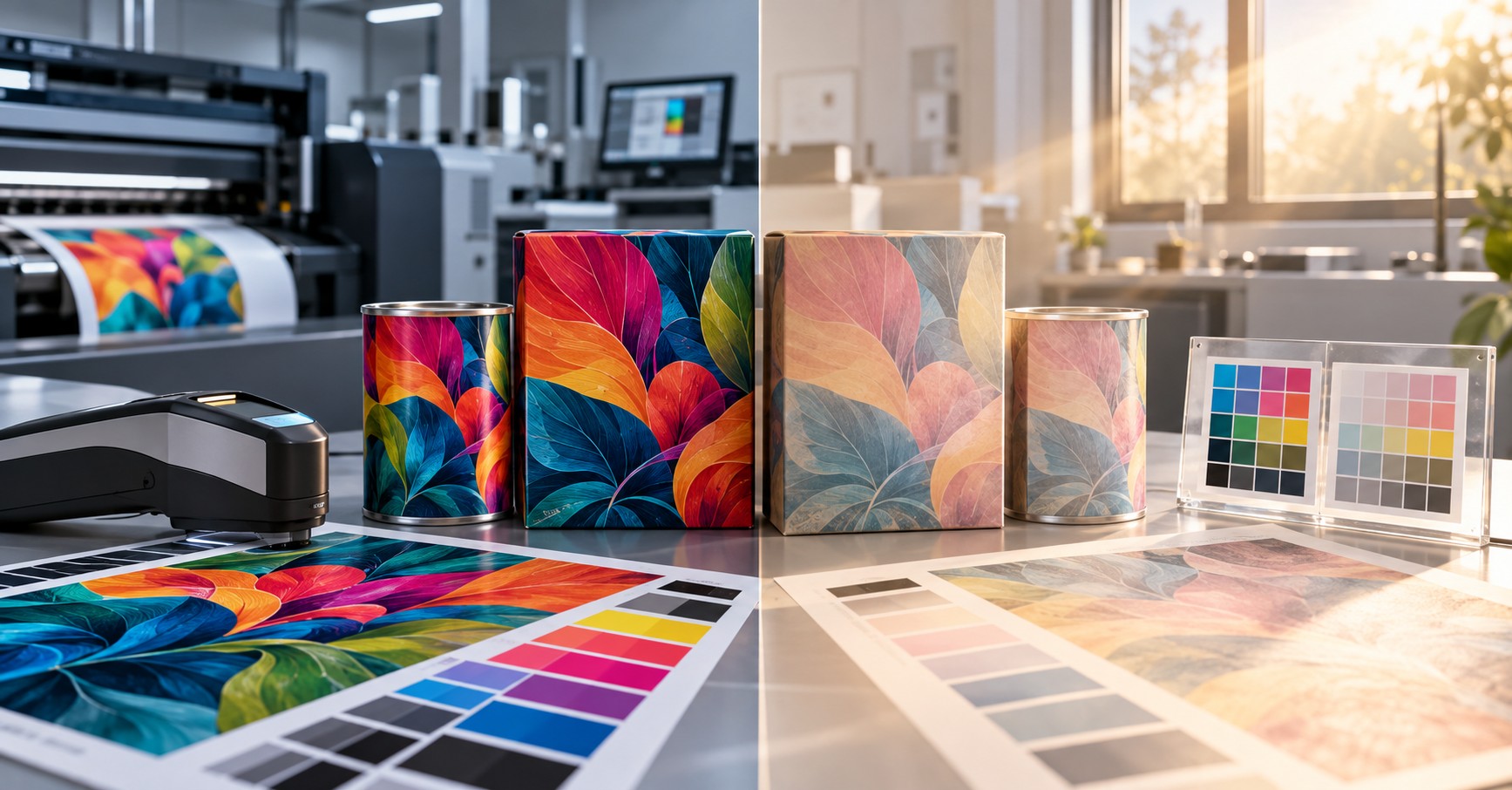
When Printed Colors Begin to Fade
Lightfastness, Ink Chemistry, and Long-Term Color Stability in Digital and Conventional Printing
By Ronen Dolev | 2026
A perfect print today. What happens after the product leaves the press?
A package leaves the press with accurate color, acceptable optical density, uniform solids, and no visible defects. Its printed appearance matches the approved reference. From the production team's perspective, the job is complete.
Months later, a customer reports that a red graphic has weakened, a yellow background looks washed out, or a brand color has shifted. Samples from the same production lot can tell different stories: products kept in a dark warehouse may still look consistent, while items displayed near a window may look noticeably different.
The first reaction is often to question press calibration or production consistency. Yet the printing process may have been fully under control. The change may have developed only after production, as the print interacted with light, oxygen, humidity, heat, and the materials surrounding the colorant.
Color accuracy at the point of manufacture and color durability during product use are separate performance requirements. A press can reproduce a target color precisely without making that image resistant to months of exposure. Lightfastness describes resistance to color change caused by light; weathering is the broader term for deterioration under combined environmental influences.
Why ordinary printing inks can fade
Most industrial printing inks derive their appearance from colorants, commonly pigments, combined with binders, resins, carriers, and functional additives. The colorant determines much of the print's spectral behavior; the remaining ingredients help deliver, transfer, dry or cure, and retain the ink layer on the substrate.
We perceive a printed color because the surface absorbs some wavelengths of incident light and reflects or scatters others. Absorbed light also supplies energy. In susceptible colorants, photons can produce excited molecular states that initiate photochemical reactions. These changes can alter the colorant's light-absorbing structure, directly or through interactions with oxygen, moisture, or surrounding materials.
This process is known as photodegradation or photofading. Ultraviolet radiation is often particularly important because shorter wavelengths carry greater photon energy, but selected visible wavelengths can also affect particular dyes or pigments. Temperature and the chemical environment may accelerate some pathways. The result may be lower saturation, a lighter appearance, or a hue shift rather than simple uniform fading.
The term "ordinary ink" should not be confused with "poor ink." Standard formulations balance color gamut, cost, printability, adhesion, drying or curing, and the intended service environment. A formulation that performs very well on a short-lived indoor package may be the wrong choice for a label repeatedly exposed to daylight. Nor is every pigment-based ink automatically lightfast: individual pigment chemistries vary considerably.
What makes a high-lightfastness ink different?
High-lightfastness ink is designed to resist light-induced color change more effectively under defined exposure conditions. The most significant difference is often the selection and integration of colorants with greater photochemical stability. Their molecular and solid-state properties can reduce the likelihood or rate of the reactions that alter their optical behavior.
A high-lightfastness formulation may also depend on how its pigments interact with the binder, dispersants, surrounding oxygen, and protective layers. Some complete print constructions use UV-absorbing or stabilizing components in a coating or laminate. Such strategies are system-specific; no single chemical additive, molecular structure, or universal formulation is shared by all fade-resistant inks.
The pigment still has to absorb light to produce color. Its advantage is not an inability to absorb radiation, but an increased ability to retain its optical properties after absorbing cumulative light energy. "Fade resistant" therefore means improved resistance or a slower rate of deterioration—not immunity from color change.
A separate point often causes confusion: an ink cured with ultraviolet radiation is not necessarily lightfast. UV curing describes how its binder network hardens during manufacture. Lightfastness describes how the resulting printed image tolerates later exposure. These are distinct properties.
Why this challenge is particularly important in digital printing
Industrial digital printing integrates ink chemistry tightly with the image-forming and transfer process. Colorants cannot necessarily be exchanged as freely as in some conventional ink systems. The ink must meet mechanical, rheological, electrical, and thermal requirements while also reproducing the required color gamut.
In liquid electrophotographic digital printing, for example, pigments may be incorporated into resin-containing particles dispersed in a liquid carrier. The particles participate in electrically controlled image formation and are ultimately transferred to the substrate as a thin ink layer. Improving the pigment's light stability must therefore be accomplished without disrupting particle behavior, transfer characteristics, or the quality of the final printed film.
A high-lightfastness color set may use specially optimized versions of selected process colors, while retaining other colors that already satisfy the durability target. This does not mean yellow or magenta pigments are universally weaker than cyan or black; relative stability is determined by the precise pigment chemistry and formulation.
The engineering benefit is the potential to extend digital printing into more demanding labels, packaging, and graphics applications without sacrificing the flexibility of digital production. However, press compatibility is only one criterion. The finished construction—including substrate, ink, varnish, and laminate where relevant—must also be validated.
How accelerated light-exposure testing works
A laboratory lightfastness evaluation exposes printed specimens and calibrated reference materials to a controlled light source, then measures changes at specified intervals. Filtered xenon-arc exposure is widely used because it can approximate selected aspects of daylight more consistently than uncontrolled natural exposure.
Test methods may prescribe the source spectrum, filter, irradiance, temperature, humidity, and light/dark cycle. Outdoor-oriented studies can incorporate further environmental influences; some tests omit water spray specifically to protect uncoated or moisture-sensitive substrates. Such a test should not be presented as a complete simulation of rain, heat cycling, and long-term outdoor service.
In one documented evaluation of a selected high-lightfastness digital ink set, 100% solid-color patches on white polyethylene label stock were exposed for up to 300 machine hours under filtered xenon-arc light. The laboratory used a spectral irradiance of 0.55 W/(m²·nm) at the stated wavelength, 25°C, and repeated light/dark cycles. Water spray was omitted for the unvarnished specimens. Under those conditions, the evaluated ink system reached a Blue Wool rating of approximately 6–7.
This result illustrates the potential of engineered digital colorants, including performance on unvarnished material. It does not prove that all digital inks achieve this rating or that a rating equates to a fixed number of months outdoors. Measurable color shifts remained in the evaluated samples. The underlying test was a formulation-specific technical evaluation rather than an independent cross-technology comparison; the manufacturer and product identities have been intentionally omitted from this article.
Understanding the Blue Wool Scale
The Blue Wool Scale (BWS) compares a sample's degree of light-induced color change with standardized blue reference materials of differing lightfastness. The scale has eight levels, from very poor resistance at level 1 to exceptionally high resistance at level 8. It is a relative comparison under the chosen test method, not a measure of elapsed calendar time.
Blue Wool rating | Practical interpretation |
|---|---|
1–2 | Very low relative lightfastness |
3–4 | Low to moderate relative lightfastness |
5 | Good relative lightfastness |
6 | High relative lightfastness |
7 | Very high relative lightfastness |
8 | Exceptional relative lightfastness |
Descriptions are explanatory, not standardized service-life guarantees.
A BWS 7 result can be compelling evidence when selecting between systems, but does not by itself predict a particular shelf life. Accumulated irradiance, spectral distribution, temperature, moisture, substrate, and the visual acceptance criterion all determine when a product becomes unfit for its purpose.
How stable is digital ink under light exposure?
A suitably designed digital ink system can maintain acceptable visual performance over extended periods when the exposure environment is moderate, and the complete print construction is compatible with the application. In some use cases, a product may remain commercially acceptable through many months of ordinary indoor or diffused-daylight exposure; in other conditions the same ink may change much sooner.
The word "acceptable" matters. Spectral instruments may detect small differences before they become objectionable to the customer. Conversely, a relatively modest shift in a critical brand color may already be unacceptable. Consequently, long-term performance must be defined by a measurement protocol and application-specific tolerance—not an unconditional promise of zero color change.
A Blue Wool rating of 7 or above does not translate to an automatic assurance of unchanged appearance for six to eight months. Such a service-life target requires a representative exposure study of the finished article, with the allowed color drift agreed upon in advance.
Neutral conditions and normal daylight: what do these terms mean?
Terms such as "neutral environment" and "normal daylight" are useful in conversation but insufficient as technical specifications unless their conditions are stated explicitly.
Neutral reference environment
For keeping a control specimen, a neutral reference environment means stable temperature and relative humidity, minimal pollution, and protection from significant light exposure. For conditioning and testing paper and board, ISO 187 specifies a standard atmosphere of 23 ± 1°C and 50 ± 2% relative humidity. These conditions define a testing atmosphere, not a universal storage-life guarantee or an illumination specification.
A protected control specimen can be compared with an exposed specimen to determine whether the principal change is associated with illumination. Where optical brightening agents are present, instrument measurement conditions must also be controlled carefully.
Moderate ambient daylight
In practical terms, moderate ambient daylight may mean diffused natural light in a covered or shaded area, without prolonged direct sun, repeated soaking, or extreme surface temperatures. Examples include indoor retail displays receiving indirect daylight or products in a naturally illuminated but protected area.
A day that is neither particularly sunny nor rainy is not a reproducible test condition. UV radiation remains present under cloud cover, and the absence of rain does not imply low relative humidity. The actual light spectrum and dose, temperature, humidity, shading, and any window glazing or protective film should therefore be documented.
Exposure environment | Typical conditions | Main durability concern |
|---|---|---|
Protected reference storage | Stable climate and minimal light | Separating storage changes from light effects |
Indoor display | Artificial light and indirect daylight | Slow cumulative photofading |
Moderate daylight | Diffused outdoor light; partial shade | Cumulative radiation with variable climate |
Direct sunlight | Higher irradiance and surface heating | Faster color and material deterioration |
Demanding outdoor use | Sun, rain, humidity, thermal cycles | Combined fading and weathering failures |
Digital printing versus offset, flexography, and gravure
Photofading is not unique to digital printing. Offset, flexographic, and gravure inks also rely on colorant chemistries whose performance varies with light exposure. All can be developed with highly lightfast pigments, and none is automatically more durable solely because of the process used to apply the ink.
In offset printing, ink supply and deposited film characteristics influence optical density and initial color appearance. Adjusting ink feed can change print density, but it cannot change the selected pigment's intrinsic photochemical stability. A correctly calibrated offset print can still fade if its colorants are unsuitable for the intended exposure.
In flexography, the chosen pigment and binder system operate together with anilox transfer, the resulting ink film, and drying or curing. Film thickness and substrate optics affect the appearance and visibility of fade, while pigment chemistry governs much of the intrinsic lightfastness.
In gravure, cell geometry and transfer conditions help define the deposited film, but the same chemical principles apply. Ink formulation and final construction must meet the anticipated environmental stresses.
Digital processes may constrain ink substitution because of their integrated operating requirements. Conventional processes may offer greater formulation flexibility in some applications, but that does not confer a universal superiority in lightfastness. Meaningful comparisons require specified ink systems, comparable substrates, representative coverage, equivalent exposure, and the same evaluation criteria.
Why some printed colors change faster than others
A photographic or brand image often includes several process colors. Each colorant can respond differently to radiation. When one component fades faster, the printed color may shift direction rather than simply become lighter.
For example, if the magenta contribution weakens in a cyan-magenta blend, the resulting hue can appear more cyan. If the yellow contribution changes in a warm or green blend, the apparent result can shift even if other pigments remain relatively stable.
Both solid patches and screened tones should be evaluated. Low-area coverage can look different from a solid because the amount of colorant and the substrate contribution differ. Critical brand colors, neutral grays, and complex secondary colors should therefore be part of the test target—not just 100% CMYK solids.
The substrate, varnish, and laminate can change the result
The appearance of a print is a property of the whole optical construction. Paper may yellow; optical brightening agents may lose activity; polymer films may become more yellow or hazy. In each case, the observer may perceive a color change even when the ink pigments remain comparatively stable.
Protective varnishes and laminates can improve durability if they reduce exposure to relevant radiation or environmental conditions. Their effect is not universal: not every clear coating or film provides meaningful UV screening, and the protection layer may itself age, yellow, or lose gloss.
Reverse-printed packaging illustrates the distinction. Placing the printed image behind a transparent film can reduce abrasion and direct environmental contact, but the film's spectral transmission determines how much damaging radiation still reaches the colorant. Protection against scuffing must not be confused with protection against photofading.
Therefore, laboratory data for ink on a generic test stock should be treated as an input to material selection, not an automatic qualification of a finished commercial structure.
How to measure color change correctly
Use a repeatable spectral measurement setup to establish the initial condition and track exposed samples over time. Report the color-difference method explicitly. CIELAB ΔE*ab (often called CIE76) and ΔE00 are different calculations; numerical results must not be treated as interchangeable.
Record not only the overall difference but its direction: lightness, chroma, and hue movement. When gloss or substrate white changes, measure those properties separately. Keep measurement geometry, illuminant/observer settings, backing, and instrument condition consistent between the original and aged samples.
The acceptance limit should reflect the product. An instrument may detect a small change that is commercially negligible, whereas a highly controlled identity color may require a tighter specification. No universal ΔE threshold applies to every aging application.
Troubleshooting: what to check when a print fades
Start with a stored sample from the same production lot and compare it with the returned or exposed article. A stable dark-stored control supports the hypothesis of exposure-related change; deterioration in both samples points toward storage aging or another material interaction. Measure each process color and key compound colors, then isolate the substrate and finishing layers.
Observed symptom | Possible cause | Recommended investigation |
|---|---|---|
One color fades faster. | Lower relative lightfastness of a colorant | Test individual process colors and compare pigment systems. |
Compound hue shifts | Unequal fading among components | Measure solids and blends separately |
Unprinted whites yellow | Substrate or optical brightener aging | Compare exposed and protected unprinted areas |
Gloss drops with limited color shift. | Coating or surface deterioration | Measure gloss and inspect protective layers. |
Highlights appear unstable | Low coverage or substrate contribution | Compare halftones with solid patches |
Only sun-exposed areas change. | Radiation and local heating | Map real exposure and reproduce it in testing. |
Dark-stored controls also change. | Thermal, chemical, or storage-related aging | Investigate storage climate, film, and binders. |
If the colorant is the controlling weakness, evaluate a higher-lightfastness ink formulation and confirm that it remains compatible with production. If the substrate or protective layer is responsible, changing ink alone may not fix the problem. Every intervention should be assessed for its effect on other requirements such as adhesion, sealing, lamination performance, migration, and regulatory suitability where relevant.
Designing a service-life validation program
Start with the printed product's intended destination. Is it displayed indoors, positioned behind window glass, installed outdoors, or used in repeated temperature and humidity cycles? Define the intended exposure and the maximum acceptable change before testing begins.
Prepare representative production specimens, including important solids, screened tones, compound colors, white areas, and finished constructions. Retain protected controls. Evaluate samples under relevant natural or accelerated conditions, with periodic measurement points. Accelerated testing is valuable for ranking candidate materials, but a universal conversion factor from machine hours to outdoor months is not scientifically justified.
Where a commercial durability period is required, combine controlled testing with real-use exposure or a validated correlation method for that application. The deliverable is not merely a BWS number; it is evidence that the product, as manufactured, satisfies a clear performance specification under defined conditions.
Conclusion: print quality must endure beyond production
Excellent color matching at press exit is only the first part of print quality. The appearance that reaches the customer is also shaped by pigment chemistry, binder and substrate interactions, protective layers, and the conditions under which the product is stored, displayed, and used.
High-lightfastness inks offer a meaningful way to reduce photofading. In digital printing, achieving this involves more than choosing a chemically stable pigment: the ink must also satisfy the image-forming and transfer requirements of the production system. Conventional printing faces the same fundamental durability physics, even though formulation and transfer constraints differ.
A strong Blue Wool rating is a useful qualification metric, but it does not guarantee unchanged color for a predetermined number of months. The reliable path is to define the service environment, select suitable materials, test the complete printed construction, and judge change against an agreed, measurable acceptance criterion.
A printed product succeeds not only when it leaves the press with the right color, but when it retains the intended visual identity throughout the useful life for which it was designed.
Technical standards and reading
- ISO 12040 — Graphic technology — Prints and printing inks — Assessment of light fastness using filtered xenon arc light.
- ISO 105-B02 — Textiles — Tests for color fastness — Part B02: Color fastness to artificial light: Xenon arc fading lamp test.
- ISO 18930 — Imaging materials — Pictorial color reflection prints — Methods for evaluating image stability under outdoor conditions.
- ISO 4892-2 — Plastics — Methods of exposure to laboratory light sources — Part 2: Xenon-arc lamps.
- ISO 187 — Paper, board and pulps — Standard atmosphere for conditioning and testing and procedure for monitoring the atmosphere and conditioning of samples.
- ASTM D3424 — Standard practice for evaluating the relative lightfastness and weatherability of printed matter.