Ronen Dolev | Industrial Color Engineering Series | October 2026
Introduction: When Two Accurate Printing Presses Produce Different Results
One of the most challenging tasks in the printing industry is achieving a consistent color appearance across different presses, printing technologies, and geographically separated production sites. Two printing presses may both be calibrated, operate within their specified tolerances, and achieve acceptable optical density values, yet still produce noticeably different-looking images.
The differences do not have to be dramatic. A subtle shift in gray balance, a change in the transition from highlights to shadows, or a variation in shadow depth can influence the perceived appearance of an entire image. One print may look warmer, another cooler, and a third may appear more contrasty, even though each press complies with its defined process-control requirements.
This leads to an important engineering question: Is controlling ink density, tone value increase, and primary colors sufficient, or do we also need a method that describes how a printed image should appear to the human eye?
The G7 methodology emerged as a response to this challenge.
As color-management systems, spectral measurement, and digital printing technologies have evolved, a further question has become increasingly relevant: Is G7 calibration still necessary to achieve high color accuracy, or can equivalent—and in some cases better—results be obtained through other calibration, characterization, and color-management workflows?
To answer that question, we must first understand what G7 measures, what it is designed to correct, and what it does not guarantee.
What Is G7, and What Is It Intended to Achieve?
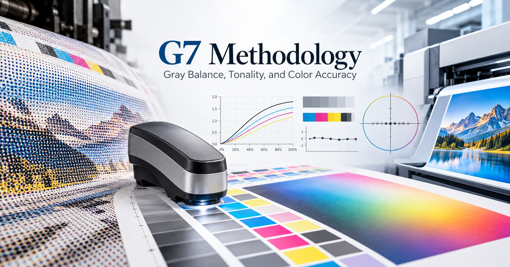
G7 is a methodology for calibrating and verifying the appearance of printed output. It focuses on two fundamental characteristics: the chromatic balance of neutral tones (gray balance) and the progression of tonal values (tonality).
The underlying premise is that human observers are especially sensitive to deviations in neutral and near-neutral areas. When a region intended to appear gray acquires a reddish, greenish, yellowish, or bluish cast, that shift affects the visual balance of the entire image.
Unlike approaches that focus primarily on the response of each of the four process-color channels independently, G7 evaluates aspects of the printing system's combined visual result.
Its aim is to establish a common tonal behavior so that different printing systems can produce similar neutral-tone appearances, even when the physical mechanisms used to form the printed image are completely different.
G7 is neither a measuring instrument nor a single standard defining every possible printed color. It is a calibration and process-control methodology, accompanied by different levels of verification against defined reference printing conditions.
The letter G refers to gray. The number 7 refers, in the traditional explanation, to the seven primary and secondary colors used to describe a four-color print condition: cyan, magenta, yellow, and black, together with red, green, and blue formed by overprinting pairs of primary process colors.
That does not mean that measuring seven colors is sufficient to characterize an entire color space. Rather, the methodology developed from the need to connect process-color behavior with the visual appearance of the resulting image.
How Did the Methodology Evolve?
Understanding the development of G7 requires a look back at the process-control methods traditionally used in conventional printing.
For decades, offset print control relied heavily on Optical Density (OD) measurements and Tone Value Increase (TVI), commonly called dot gain. Optical density was used to monitor ink-film behavior, while TVI described the difference between the nominal tonal value and the effective printed tone value.
These measurements remain important tools for maintaining a stable printing process. However, two systems with similar TVI curves do not necessarily produce images with the same visual appearance.
The final image is not determined by TVI alone. Ink hue, substrate properties, ink opacity and transparency, overprint behavior, screening characteristics, and viewing conditions all influence the printed result.
The idea that a common calibration of neutral tones could improve visual matching gained attention well before G7 was formally introduced. During the early 2000s, particularly around 2003–2004, collaborative print trials explored an alternative to relying exclusively on independent channel-based TVI aims: calibration toward a common neutral tonal appearance.
These trials indicated that, under relevant conditions, direct control of neutral-tone behavior could produce better visual agreement between printing systems than comparing TVI curves alone.
G7 was formally introduced to the industry in 2005. Over time, the methodology evolved and became integrated with print characterization, reference printing conditions, and qualification programs. It was adopted as a practical method for improving common appearance across a range of print technologies.
A particularly important conceptual shift was the move away from using the mechanical behavior of one particular press as the reference. Instead, the goal became a defined and documented print condition.
Rather than forcing every press to behave mechanically like another press, different printing systems could be calibrated and managed toward an agreed tonal and colorimetric result.
This development did not eliminate the value of existing process-control standards. It added another approach to achieving consistent visual output.
The Scientific Principle: Why Gray Balance?
Appropriate combinations of cyan, magenta, and yellow can reproduce a progression of neutral and near-neutral tones, extending from the paper white toward dark regions.
In practice, however, nominal CMY values do not guarantee neutrality. Even when all three channels meet acceptable tone-value tolerances, the printed result may exhibit an unwanted color cast. Small differences in the tonal response or hue of one process color can change the appearance of gray.
G7 addresses this issue through defined neutral or near-neutral tonal aims, including consideration of the printing substrate color.
The substrate is particularly important. A yellowish paper is not necessarily expected to produce the same absolute CIELAB values as a bluish white paper. Interpret the aims according to the rules for the relevant reference condition and how neutral tone appearance relates to the actual substrate.
Alongside chromatic balance, G7 defines the lightness progression across the tonal scale.
The calibration therefore addresses two related but distinct questions: Does gray actually look neutral, and does the progression from highlights to shadows follow the intended tonal response?
Two presses may produce a neutral midtone gray but different shadow contrast. Alternatively, their lightness curves may be similar while one system produces a visible chromatic cast. Both aspects must therefore be assessed.
What Is Actually Measured in G7?
G7 evaluation uses printed test targets containing tonal steps of black and combined CMY, often supplemented by additional color patches for broader verification.
A spectrophotometer measures the printed patches, and analysis software compares the data against the relevant calibration and verification aims.
Three concepts are fundamental to understanding the results.
Neutral Print Density Curve (NPDC)
The NPDC describes the relationship between an input tone value and the neutral print-density or lightness behavior obtained in the printed result.
It is not simply a solid ink-density curve for an individual primary color. Instead, it describes neutral-scale tone reproduction, including a black-only scale and a composite CMY scale.
The aim is to align the measured response with the applicable reference curve, while accounting for the usable density range of the printing system and substrate.
Weighted ΔL*: Tonal Lightness Deviation
This metric evaluates differences in tonal lightness between the printed result and the G7 aim, according to the methodology's weighting and calculation rules.
An excessive deviation can mean that portions of the neutral scale are too light or too dark, even when the chromatic balance itself is acceptable.
Weighted ΔCh: Chromatic Gray-Balance Deviation
This metric evaluates the chromatic deviation of tones intended to be neutral or nearly neutral.
A high value may indicate a color cast that moves the printed gray away from the intended neutral behavior.
By evaluating lightness and chromatic deviation separately, G7 helps distinguish a tonal-response problem from a gray-balance problem. This is more useful diagnostically than relying on one number that does not reveal the underlying type of variation.
Some historical verification specifications, including training materials published in 2020, showed average tolerances of 1.5 and maximum tolerances of 3.0 for the weighted grayscale lightness and chromatic-deviation metrics. These values should not automatically be treated as the current universal acceptance criteria. Formal verification and qualification must always use the requirements, target data, and thresholds applicable to the selected methodology and current specification edition.
How Is G7 Calibration Performed?
A professional calibration process starts by stabilizing the printing system—not by immediately applying a correction curve.
The first step is to confirm that the press is in an appropriate operating condition, that the substrate is suitable for the intended process, and that the primary ink channels behave consistently with the established production baseline.
A test target containing tonal scales and color patches is then printed. Spectral measurements reveal the tonal behavior of black and combined CMY, and the deviations from the required neutrality and lightness aims.
Calibration software analyzes these differences and, depending on the implementation, can calculate correction curves for the CMYK channels.
After applying the corrections, the target is printed and measured again. Several iterations may be necessary to reach the required result.
The essential engineering distinction is that a CMYK correction curve is a means of achieving the target, not the target itself.
If a printing system can achieve the same aims through internal calibration, multidimensional correction, or a combination of color management and calibration, evaluate its measured output rather than judging the method solely by the specific mechanism used to reach the aim.
Equally important, when a deviation is mechanical, material-related, or operational, a correction curve may conceal the actual problem instead of eliminating it.
G7 calibration should therefore be part of a broader process-control strategy, not a substitute.
The Three Conformance Levels: Why Gray Balance Alone Is Not Enough
A common misconception is that a press meeting G7 requirements must necessarily reproduce every color accurately.
The distinction becomes clearer when examining the three verification levels historically associated with G7 qualification.
Conformance level | What is evaluated? | What it does not guarantee by itself |
|---|---|---|
Grayscale | Neutral gray-axis behavior and tonal progression | Matching of primary and secondary colors, or the entire color space |
Targeted | Grayscale plus substrate color, primary solids, and secondary overprints versus a reference | Matching across all intermediate color combinations |
Colorspace | Broader statistical colorspace matching, in addition to the lower-level requirements | Guaranteed accuracy for every brand color, substrate, or finishing condition |
The differences between these levels are fundamental.
A press may meet the Grayscale requirements and still show significant deviations in saturated hues, overprinted colors, or colors near the boundaries of its available gamut.
The Targeted level also tests whether primary and secondary solid colors meet the aims of a defined reference printing condition. The Colorspace level uses a broader set of color measurements to assess the reproduction of the referenced color space.
Consequently, when the objective is high color accuracy rather than neutral-tone consistency alone, grayscale measurements are insufficient.
The full color response must also be verified using CIELAB values, color-difference metrics such as ΔE00, and appropriate statistical evaluation of numerous printed color patches.
Moreover, a low mean ΔE00 does not necessarily guarantee that all critical colors are acceptable. A small number of significant deviations in important brand or product colors can be commercially unacceptable, even when the overall average appears good.
Measurement Conditions: Why Can the Same Print Produce Different Results?
The reliability of G7—like any print-color control method—depends on both the calibration aims and consistent measurement conditions.
ISO 13655 establishes spectral measurement conditions used in the graphic arts, including M0, M1, and M2.
M0 represents a legacy measurement condition in which the ultraviolet content of the instrument illumination is not controlled in the same way as in M1.
M1 is designed for measurement conditions consistent with D50 requirements and improves reproducibility when the substrate contains optical brightening agents that respond to ultraviolet radiation.
M2 uses UV-excluded measurement conditions and can be useful for specific purposes where the influence of optical brighteners is intentionally suppressed.
When comparing results between presses or production sites, all measurements should use the same appropriate measurement condition, and the selected reference characterization data must match that condition.
Results measured in M0 cannot be assumed to be directly equivalent to M1 measurements, particularly for substrates containing optical brighteners.
You also need to define the measurement backing, substrate condition, measurement geometry, and viewing conditions. Visual evaluation under controlled D50 viewing illumination helps connect instrumental readings with human perception.
The practical lesson is straightforward: Before correcting a color deviation, confirm it is not due to inconsistent measurement conditions.
Conventional Printing Versus Digital Liquid Electrophotography (LEP)
Although G7 establishes a common approach to gray balance and tonal reproduction, its practical implementation varies across printing technologies. The distinction lies primarily in how each printing process controls ink transfer, optical density (OD), tonal response, and the relationship between digital input values and the final printed result.
In conventional printing, color reproduction is closely linked to physical and mechanical process conditions. In digital Liquid Electrophotography (LEP), these conditions remain important, but color adjustments are largely managed through integrated press calibration and digital color-management systems. Understanding these differences is essential when determining how G7 should be implemented and whether a separate G7 calibration is necessary.
Offset Printing: The Relationship Between Ink Density and Tonal Control
In offset printing, color reproduction depends on the interaction between ink-film thickness, plate characteristics, blanket transfer, ink-water balance in conventional wet offset, substrate properties, and press operating conditions.
Optical density is a primary parameter used to control the printing process. By adjusting the ink supply through the press's ink-zone control system, operators can influence the thickness of the transferred ink film and, consequently, the optical density and colorimetric properties of the printed solids.
However, changing ink-film thickness does not affect solid density alone. It can also influence tone value increase (TVI), overprint behavior, gray balance, and overall color appearance. Therefore, achieving the specified CMYK solid densities does not necessarily guarantee accurate tonal reproduction or neutral gray balance.
Traditional offset process control relies on both solid ink density and TVI measurements to establish a stable printing condition. While these measurements are essential, two presses operating within similar density and TVI tolerances may still produce visibly different neutral tones and tonal transitions because of variations in ink colorimetry, substrate characteristics, and ink-transfer behavior.
G7 addresses this difference by introducing a common neutral tonal reference based on the Neutral Print Density Curve (NPDC) and gray-balance aims. Once the press is stabilized and its solid ink conditions are established, appropriate calibration curves can align the printed tonal response with the defined targets.
In this context, G7 complements conventional offset process control. It does not replace the need to maintain correct ink density, printing conditions, and mechanical stability; rather, it provides an additional way to improve visual consistency between presses.
Flexographic Printing: Controlling Ink Transfer and Tonal Response
Flexographic printing introduces a different set of process variables. Ink transfer is governed largely by anilox characteristics, effective cell volume, ink rheology, plate properties, impression settings, and substrate surface characteristics.
Unlike offset printing, where ink-film thickness can be adjusted through ink-zone controls during production, flexographic ink delivery is strongly influenced by the selected anilox configuration and the conditions under which ink is transferred to the printing plate and substrate.
Changes in viscosity, anilox condition, plate deformation, or printing pressure can affect both solid color reproduction and tonal behavior. These interactions make process stabilization particularly important before calibration curves are established.
G7 can be applied to align the neutral tonal response of a flexographic press with a common reference, even when its TVI characteristics differ substantially from those of an offset press. Nevertheless, tonal correction cannot compensate for unstable ink transfer, unsuitable materials, or limitations in the achievable color gamut.
Digital LEP: Calibration and Color Characterization
Digital Liquid Electrophotography forms the printed image through an electrophotographic process using liquid ink and controlled image transfer. Its color reproduction depends on ink properties, imaging and development conditions, transfer consistency, substrate characteristics, and digital image processing.
Unlike offset printing, LEP does not use conventional ink-zone adjustments to control ink-film thickness. Optical density and tonal reproduction are managed through the press's process-control and calibration mechanisms, supported by digital lookup tables (LUTs) that establish the relationship between input values and printed tonal response.
Beyond tonal calibration, LEP systems may incorporate spectrophotometric measurement, substrate-specific color characterization, ICC output profiles, and multidimensional color transformations. These capabilities allow the printing system to model its color response on a particular substrate and reproduce a defined reference printing condition within its available color gamut.
An important distinction must be made between calibration and characterization. Calibration establishes a predictable, repeatable printing condition, while characterization describes that condition's colorimetric behavior and provides the information needed for accurate color conversion. A color profile cannot independently compensate for an unstable press; reliable characterization depends on a properly maintained and calibrated printing system.
G7 can be incorporated into this workflow to establish the desired gray balance and NPDC response. However, where the existing LEP calibration and color-management process already achieves the required neutral tonality and colorimetric accuracy, applying an additional G7 correction may offer little practical benefit.
The need for such a correction should therefore be determined through measurement and verification, rather than assuming that every printing technology requires the same calibration procedure.
A Common Color Objective Across Different Printing Technologies
The essential distinction between offset, flexography, and LEP is how each process reaches and maintains a defined printing condition.
Offset printing combines physical ink-film control with tonal calibration. Flexography relies on stable ink-transfer conditions and carefully controlled mechanical and material parameters. LEP combines controlled image formation with digital calibration and color characterization.
Despite these differences, all three technologies can be evaluated against common neutral-tonality and colorimetric targets. G7 provides a structured approach to achieving comparable gray balance and tonal appearance, particularly when work must be reproduced across different presses or printing technologies.
However, matching the G7 neutral aims is only one component of color accuracy. Reproducing primary and secondary colors, intermediate tones, and critical colors requires broader colorimetric verification against an agreed reference printing condition.
Ultimately, the objective is not to make different printing technologies behave identically, but to achieve consistent, measurable, and repeatable color reproduction through the control mechanisms appropriate to each process. G7 can contribute to that objective, while comprehensive color management and process stability determine how reliably it is maintained.
Can We Omit G7 and Still Achieve High Color Accuracy?
Yes—but the meaning of color accuracy must be defined carefully.
Color accuracy is not determined by the name of the calibration method. It is determined by agreement between the printed result and a specified target under defined measurement conditions, together with the system's ability to maintain that agreement over time.
ISO/TS 10128:2023 addresses alternative approaches for adjusting a printing system's color response to characterization data. These include TVI-based matching, near-neutral tone approaches, colorimetric adjustment strategies, and multidimensional CMYK conversion methods.
From an engineering perspective, several calibration and color-management approaches can therefore be used to achieve an intended print response.
If a digital press is properly calibrated, has a reliable substrate characterization, uses suitable input and output profiles, and passes colorimetric verification against its agreed reference, a separate G7 calibration step is not inherently required merely to demonstrate color accuracy.
Nevertheless, omitting a particular calibration procedure is not the same as omitting a contractual or formal qualification requirement.
If a customer specifically requires G7 verification or facility qualification, you must meet the applicable requirements. A strong ΔE00 result, by itself, does not automatically substitute for the required formal conformance evidence.
More importantly, even where formal G7 qualification is not required, gray balance and tonality should not be neglected.
An organization can choose not to run a formal G7 calibration workflow, but it still needs to verify that neutral tones, lightness progression, and the broader color space are stable and controlled.
What Matters More: G7 Compliance or Full Reference-Color-Space Matching?
This question matters most in packaging, labels, and other applications with stringent color requirements.
Consider a production site using an offset press and an LEP press for the same customer artwork.
Both presses may be calibrated to G7 neutral-tone aims, improving agreement in gray areas. However, if one press can reproduce a highly saturated red outside the other press's available gamut, matching the grays will not eliminate the difference.
The challenge requires color management that accounts for each process's gamut, the substrate properties, and the chosen color-conversion strategy.
For demanding color work, three separate dimensions of performance should therefore be evaluated.
The first is process stability: Does the press return to consistent color behavior during the run and from job to job?
The second is tonal and neutral agreement: Do the lightness response and gray balance conform to the intended reference?
The third is full colorspace agreement: Do the primaries, secondaries, intermediate colors, and application-critical colors meet the required tolerances?
A system may excel in one dimension while being limited in another.
Professional color accuracy therefore depends on a combination of process control, calibration, characterization, and broad verification. G7 can contribute to that system, but it cannot replace all of its components.
The Development of G7+: Adapting the Methodology to Modern Printing
G7+ was introduced in 2024 as an evolution of the original methodology, aimed at improving its suitability for a wider range of printing conditions, substrates, and technologies.
The updated approach largely preserves the familiar visual appearance targeted by traditional G7 while refining the algorithms used to establish tonal and gray-balance behavior.
Changes include improved handling of systems with limited density range, more flexible treatment of substrate color, and refinements to the response of high-density areas.
One feature is the optional High-Density Smoothing (HDS) mechanism, intended to help address discontinuities or problematic behavior in very dark or highly dense tonal regions where certain processes may struggle to respond smoothly.
Refinements in the treatment of Substrate-Corrected Colorimetric Aims (SCCA) also support more consistent handling of printing substrates whose color differs from that of the reference medium.
These developments reflect an important direction in printing engineering: Rather than assuming that one calibration curve will behave identically on every press, greater attention is being paid to each system's dynamic range and material limitations.
By 2026, supporting verification tools and qualification frameworks for G7+ had been published, while traditional G7 remained in use.
As of October 2026, international standardization work was also exploring the inclusion of near-neutral calibration approaches in future revisions of ISO 12647-2. Such development activity should not be confused with an already effective universal requirement.
The practical conclusion is not that every operation must immediately adopt G7+, but that neutral-tone calibration methods are continuing to evolve alongside measurement science and digital color management.
How Should These Principles Be Applied in a Printing Facility?
A sound engineering approach begins with the objective: Is the goal consistency among presses, agreement with an approved proof, conformance to a specified reference print condition, or high accuracy for selected brand colors?
Once the objective is defined, prepare the press and check its operating conditions for repeatability.
The substrate definition, ink-transfer system, primary-color behavior, and ability to return to calibrated baseline values must be assessed.
The next stage is technology-appropriate color calibration. In conventional printing, this may involve mechanical adjustments and tone-correction curves. In LEP, it may involve internal calibration, tonal-response control, and spectral characterization of the substrate.
Only after the system is stable should you verify printed output against the agreed reference data.
Verification should include neutral balance, tonal behavior, primary and secondary colors, and measured color differences across a sufficiently broad set of color samples.
Where specific colors are commercially critical, those colors should also be measured and evaluated individually.
Process repeatability is just as important. A successful measurement immediately after calibration does not demonstrate that the press will maintain the same response several hours later, after a substrate change, or on a different production day.
Finally, when finishing processes affect appearance—such as lamination or varnishing—evaluate the final converted product as well. Finishing layers can change surface optics, gloss, and perceived color even when the original printed sheet met the required colorimetric aims.
Diagnosing G7 or Color-Management Failures
When measurements fall outside tolerance, the first response should not necessarily be to create another correction curve. The deviation may originate in the measurement process, substrate, printing system, or color-conversion workflow.
If the NPDC is not matching the intended aim, the tonal response and press calibration should be checked first. In conventional printing, changes in TVI or ink-transfer conditions may be relevant. In LEP, examine calibration status, ink-film consistency, substrate definition, and tonal response.
If chromatic neutrality is poor while lightness behavior is acceptable, the relationships between the CMY channels, the behavior of the primary colors, and compatibility between measurement conditions and reference data should be investigated.
If Grayscale passes but Colorspace fails, the likely causes may include primary colorimetry, overprint behavior, gamut limitations, or color-management conversions. Continuing to adjust only the gray-balance curve is unlikely to resolve all of these problems.
If a press previously met its requirements but now shows progressively increasing deviations, ask whether the process is drifting. Modifying the color profile to compensate for an unstable press can hide the real cause and undermine future reprint consistency.
If two calibrated presses still fail to match each other, verify that they use the same agreed reference characterization, compatible measurement conditions, and a common color-conversion strategy. Also consider whether differences in substrate white point or available gamut make an exact match physically unattainable.
The goal of troubleshooting is not merely to obtain a one-time PASS report. It is to restore a stable, predictable, and controllable process.
Conclusion: G7 Is a Valuable Method, but Color Accuracy Is the Objective
G7 made an important contribution to print-color control by shifting some focus from independent process measurements to the visual appearance of printed output, especially neutral-tone behavior.
It helped establish a common language across printing systems and offered measurable methods for improving tonal and visual consistency.
Its value is particularly clear in operations where print jobs move between presses, production sites, and printing technologies.
However, the rise of digital printing and modern color-management systems makes it essential to distinguish calibration methods from the accuracy of the final printed result.
In LEP, where internal calibration, substrate characterization, and multidimensional color management may be available, high colorimetric accuracy can be achieved without a separate G7 calibration step—provided the relevant performance criteria are measured and verified against defined targets.
Conversely, successful G7 calibration alone does not guarantee correct reproduction of an entire color space or every brand color.
The most useful professional question, therefore, is not simply whether a press uses G7, but whether it can reproduce the required colors, remain stable, and reliably return to the same result.
The true measure of a color-management system is not the calibration method it uses, but its ability to deliver accurate, predictable, and repeatable color—regardless of printing technology.
References and Technical Basis
The discussion draws on two supplied technical application and training documents dated 2020 and 2021, together with relevant graphic-arts standards and professional development. The article is an original technical synthesis, not a reproduction of the training documents.
- Technical qualification training presentation (2020, supplied reference): historical G7 conformance levels, weighted grayscale tolerances, and digital print verification workflows.
- Technical color-matching and qualification guide (2021, supplied reference): print baseline, substrate characterization, digital calibration, M0/M1/M2 measurement, and qualification workflows.
- CGATS/Idealliance TR 015-2022: G7 gray-balance and near-neutral calibration concepts.
- ISO/TS 10128:2023: Methods of adjustment of the color reproduction of a printing system to match a set of characterization data.
- ISO 13655: Graphic technology — Spectral measurement and colorimetric computation for graphic arts images.
- ISO 12647 series: Process control for the production of half-tone color separations, proof, and production prints.
- G7+ methodological developments (2024–2026): refinements in near-neutral calibration, substrate color correction, and high-density behavior.